

We collaborated with Moe's Records on a full identity refresh that bridges the past and present of the brand.
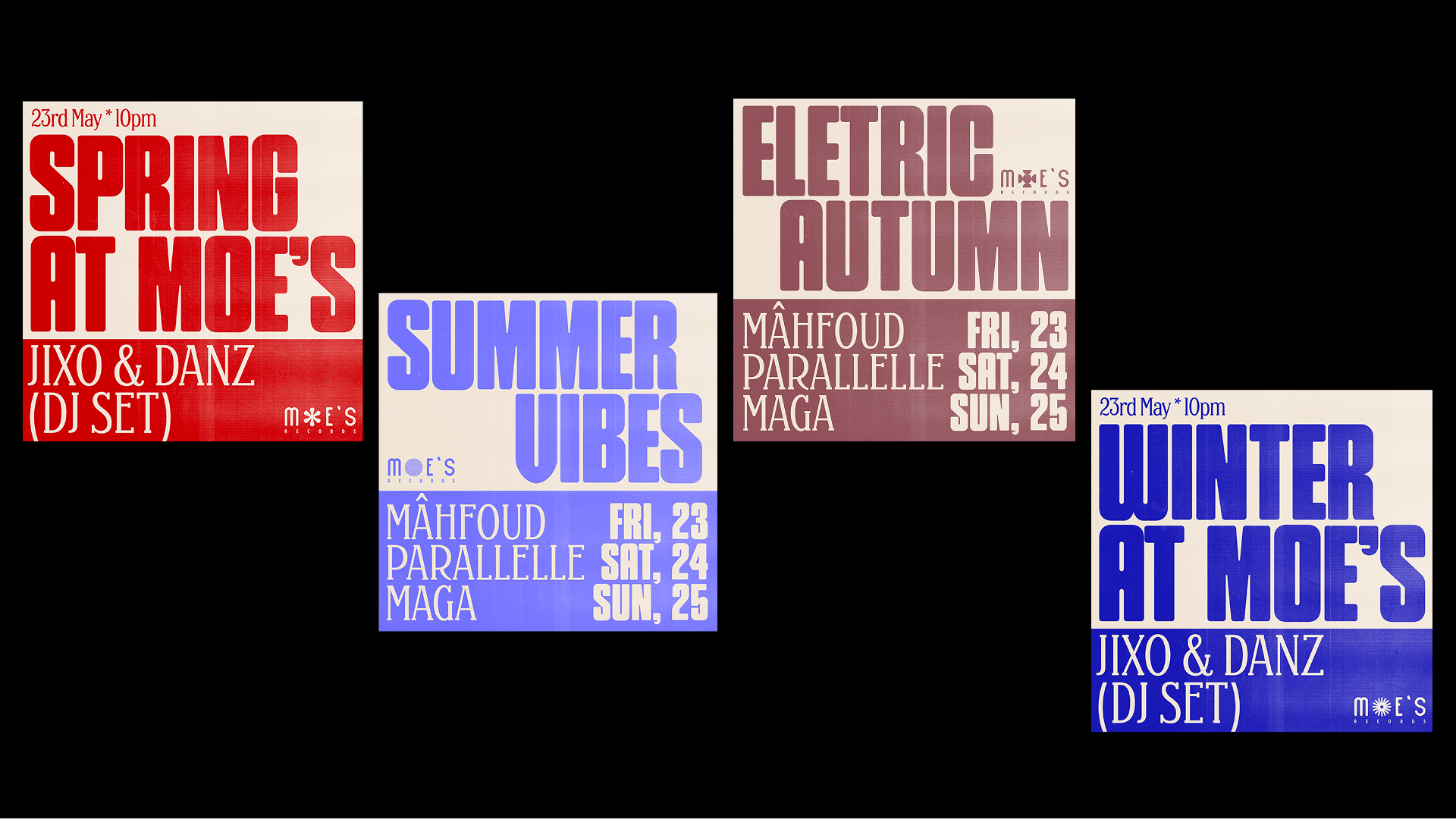
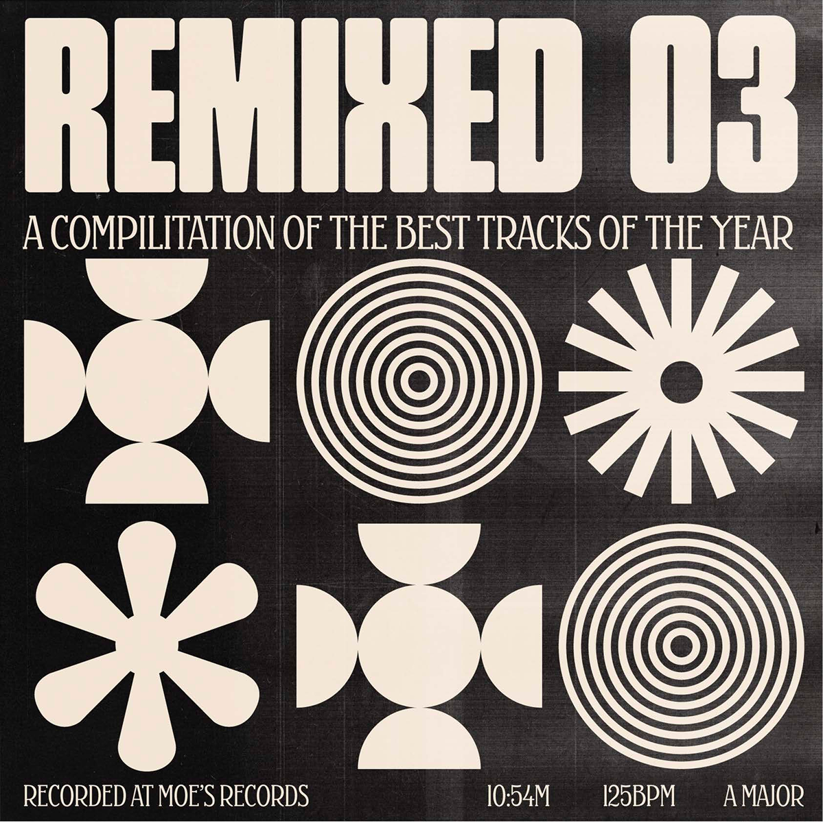
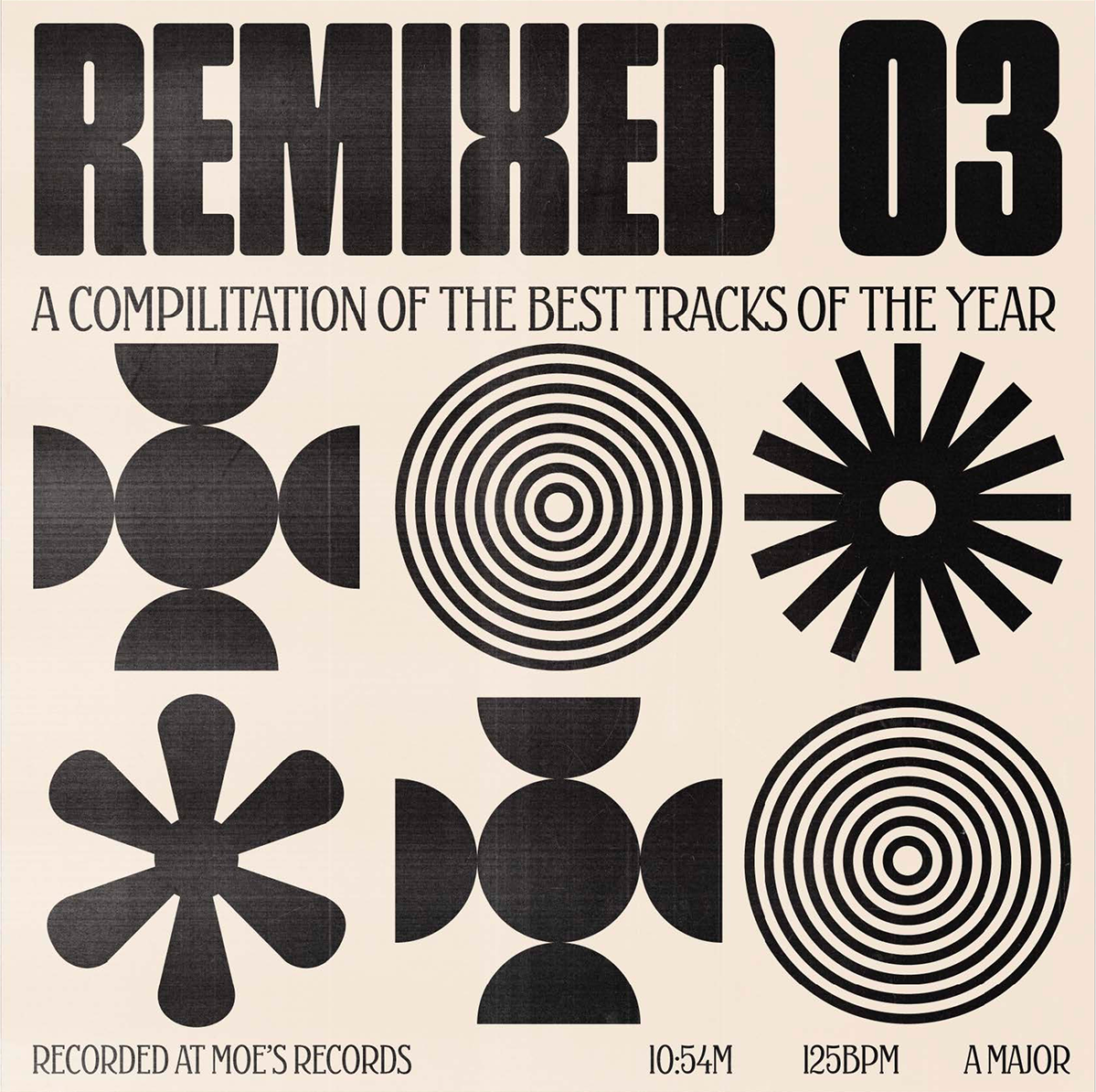
The updated visual system blends bold typography, vintage textures, and analog-inspired imagery to evoke a nostalgic yet contemporary mood.


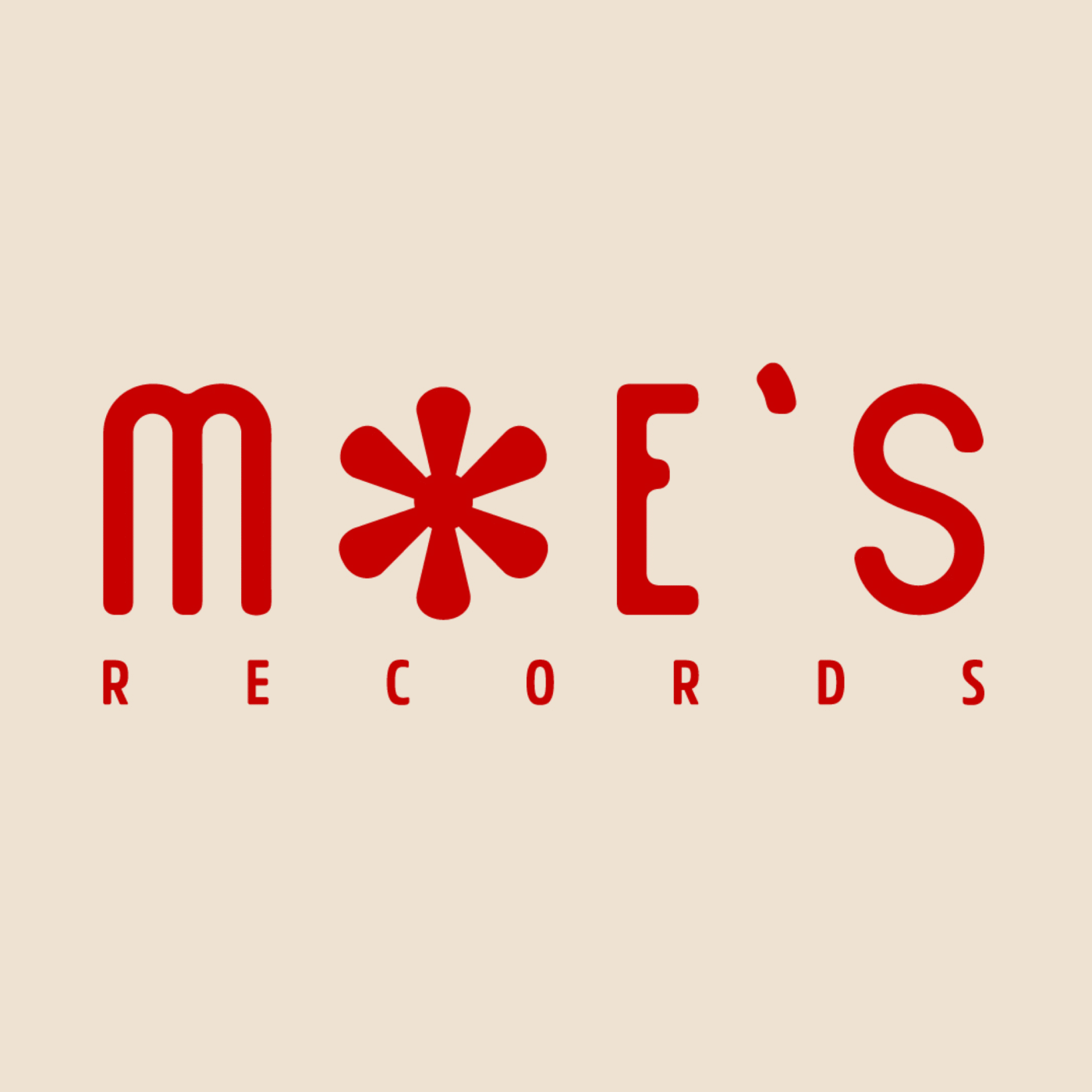
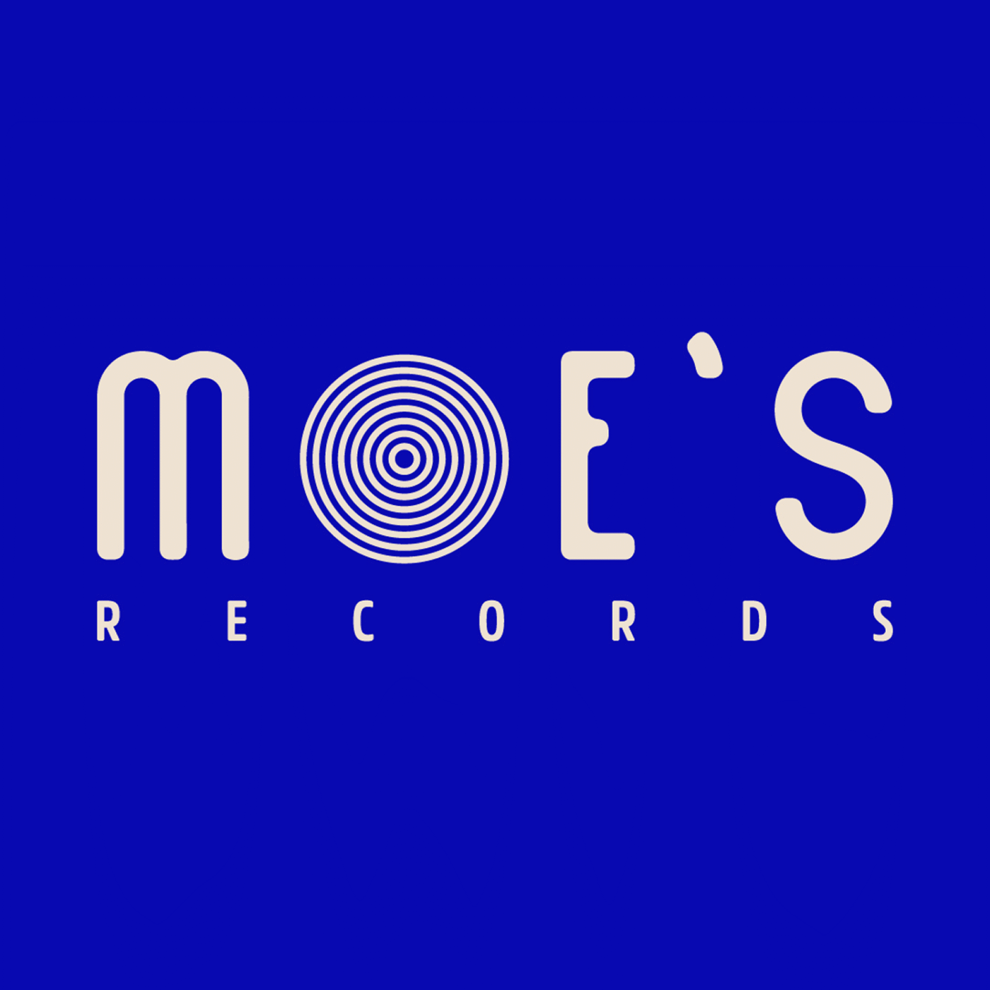
We refined the original logo for clarity and versatility, while introducing playful seasonal versions that reinvent the iconic ‘O’ with rotating symbols.
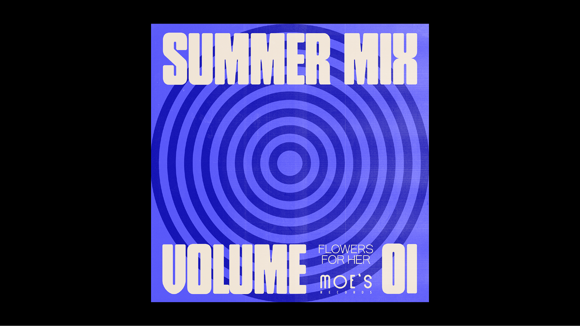
he result is a flexible identity that feels rooted in musical culture, but open to constant reinvention.
Project Title
MOE’S RECORDS
Client
Moe’s records
Date
2024
Industry
Music
Services
Creative Direction, Branding, Graphic Design, Motion Graphics, Social Media
In collab with:
Bárbara Caria
Description
Moe’s Records is an independent record label with a strong visual and cultural legacy. As the brand evolved, they reached out to Pira to develop a refreshed identity that felt modern while honoring its roots. Drawing inspiration from analog archives, disco nostalgia, and bold graphic gestures, the new system balances simplicity with expressive detail. From the reworked logo to a set of seasonal variations, the identity invites play while staying true to the label’s original energy.